Last year, I created NU Courses, a set of scripts to fetch course and section information from Banner, the service Northeastern University uses for registration. I always found it frustrating to navigate Banner’s clunky interface and wished there was an easier way to explore all courses. So, I set out to create a tool that would allow anyone to quickly browse and filter through the catalog of courses.
At the time, I would fetch the courses as static JSON files and use them in Husker in the courses page (what’s Husker?). While this was a good start, I soon realized that there was more I could do to improve the course planning and selection process. One common pain point for students is trying to create schedules along with friends by signing up for the same sections. While there are many existing tools available to help with this, I found them to be either too complex or not flexible enough for my needs.
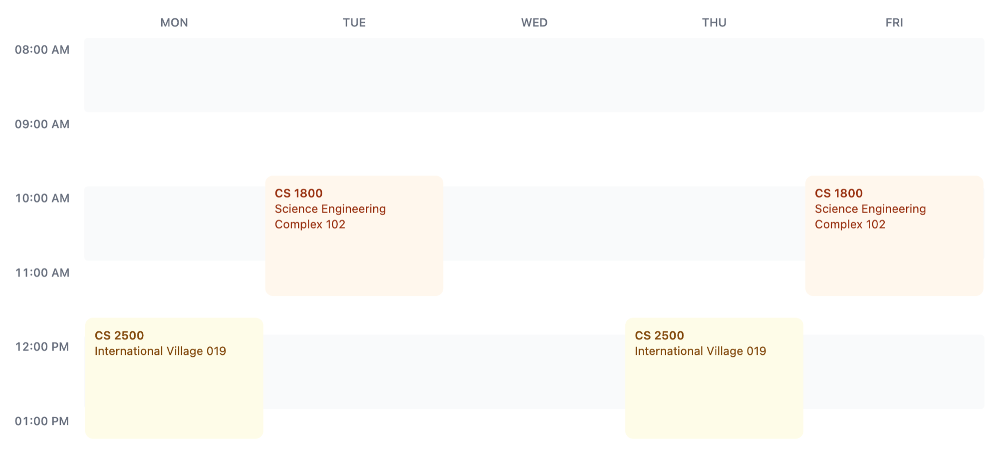
With all the time I have now, I thought I’d revisit this project and implement course planning features. I’ve wanted to do something like this for a while, but I never knew how to create a weekly calendar view. After some research, I found that CSS grid is really powerful for such layouts. With CSS grid, I was able to create a clean and intuitive week view that displays a student’s classes in compact format.

A basic demo is available at coursky.vercel.app (name not final). The site allows students to search for courses by term and keyword, then add them to their schedule. The schedule displays any conflicting classes too. One feature I want to add is sharing plans. Students often share plans by sending screenshots, but being able to share just a URL will be more convenient.
While the site is still a little rough around the edges, I’m excited about its potential to make the course selection process more efficient and enjoyable for Northeastern students. Star and watch the repositories for updates!