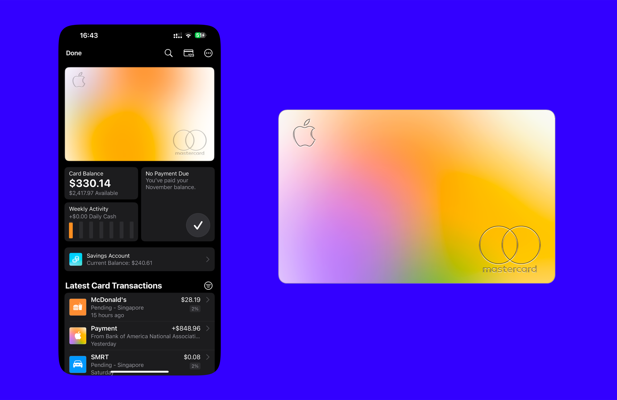
For the longest time, I’ve recorded by personal expenses using Google Sheets. Adding expenses on Google Sheets has always been clunky and difficult on my phone, so I decided to create a Google Form to make this easier.
This made adding expenses way easier, especially on mobile. But being a a software and product engineer, I thought I could take this further and create a full-fledged expenses application using a Google Forms and Google Sheets as the backend.
UI Inspiration: Apple wallet

I really like the colors and list view of Apple Wallet. I like to see a quick summary of my month’s spendings with the overall colors of the Apple Card.
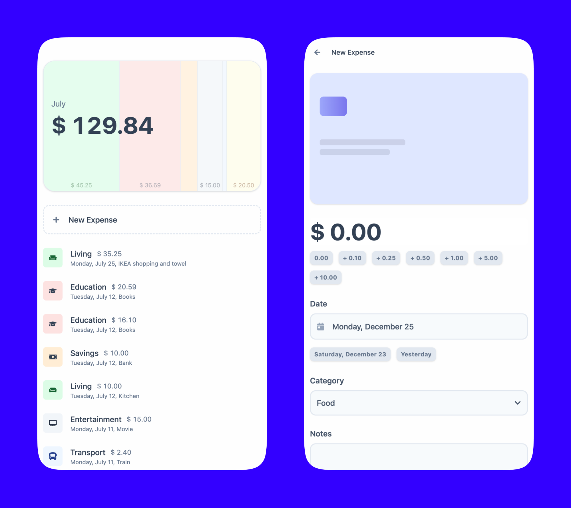
Initial UI

Left side: expenses view and summary
- This view shows the spending by month.
- The “card” on the top shows a breakdown of spending by category through the colors. In this example, the most has been spent on the “Living category”.
- Every individual expense/transaction can bee seen below.
Right side: add expense form
- An amount can be entered either by typing or by using the buttons.
- For example, rather than typing “7.35”, the user can press the “+5.00”, the “+1.00” button twice, the “+0.25”, then the “+0.10” button.
- react-number-format was helpful for the number input.
- To enter the date, either the date picker, or the quick buttons for “yesterday” or “day-before yesterday” can be used.
Update: 2025 Revisit
I ended up creating the project and using it. Check out the blog post about it!
As for this specific design, I definitely think I got a few things right. I do like the colors to show categories. While they don’t look as pretty as what the Apple Card has, I do find that it is slightly useful to see an “at a glance view” that shows me where most of my money has gone for the month. The Apple Card UI looks great, but it doesn’t tell me all that much other than a very rough estimate.
I do like how, rather than having a solid dominant button, I used dotted-line border for the “New Expense” button. I haven’t really seen this done all that much. I think it makes sense, because the button is directly where a new expense will be added to the UI. I also wanted this UI to be mainly for viewing my trends and understanding where I spent my money, so I didn’t want a dominant primary button to distract from that.
And as for things I would now do different, the first would probably be the overall layout of each expense. It’s a little crowded because there are four pieces of data: the category, the data, the amount, and a the description. I think it would make sense to have some separation, for example, the category and description on the left, and the date and amount on the right.
I think it would also benefit by grouping expenses by week. That way, I can quickly check at a glance how much I’ve spent in a week. It would also add some breathing room to the UI.