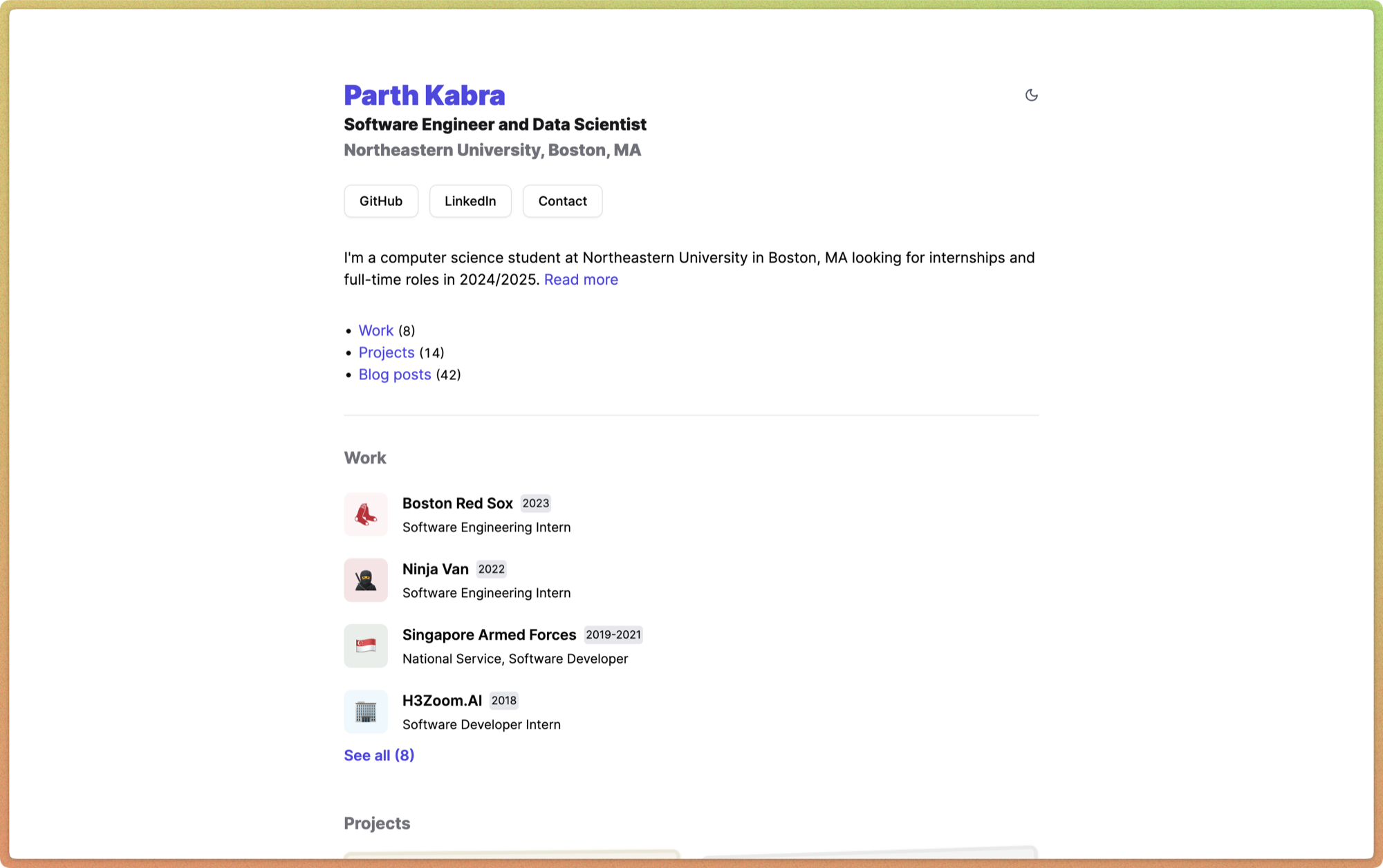
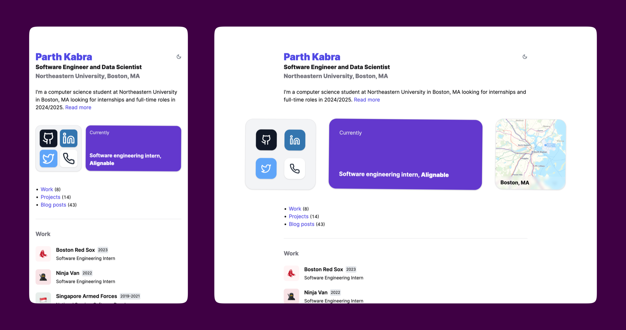
I’m a big fan of the bento layout for displaying product features. My website’s links and information are displayed in a pretty simple and boring manner, so I was wondering if I could improve it and make it more pretty.

Taking inspiration from many layouts I’ve seen and various Tweets (which I unfortunately didn’t save), I created a layout:

I added a slight random rotation to each bento item/cell, which I think improves the layout and makes it more “playful”.