The problem
My university (Northeastern University) used to have this website called myNortheastern. It was pretty simple and easy to use, and contained a list of useful links and resources, such as Canvas, advising services, course registration, degree audit, printing services, and more. It was a list of links to other pages.
Unfortunately, it was closed in favor of the new and “improved” Student Hub which is not as user-friendly. The page takes around 10 seconds to load completely. Accessing simple links takes a lot of clicks. It is not very mobile friendly.
A simple website
After being accepted, I was always getting overwhelmed by the number of links and resources and how they’re all over the place. So I created a Google Sheet for myself. I that that other incoming freshmen could benefit from this too, so I decided to share it around. I had added many categories such as Services, Personal resources, free stuff, and so on.
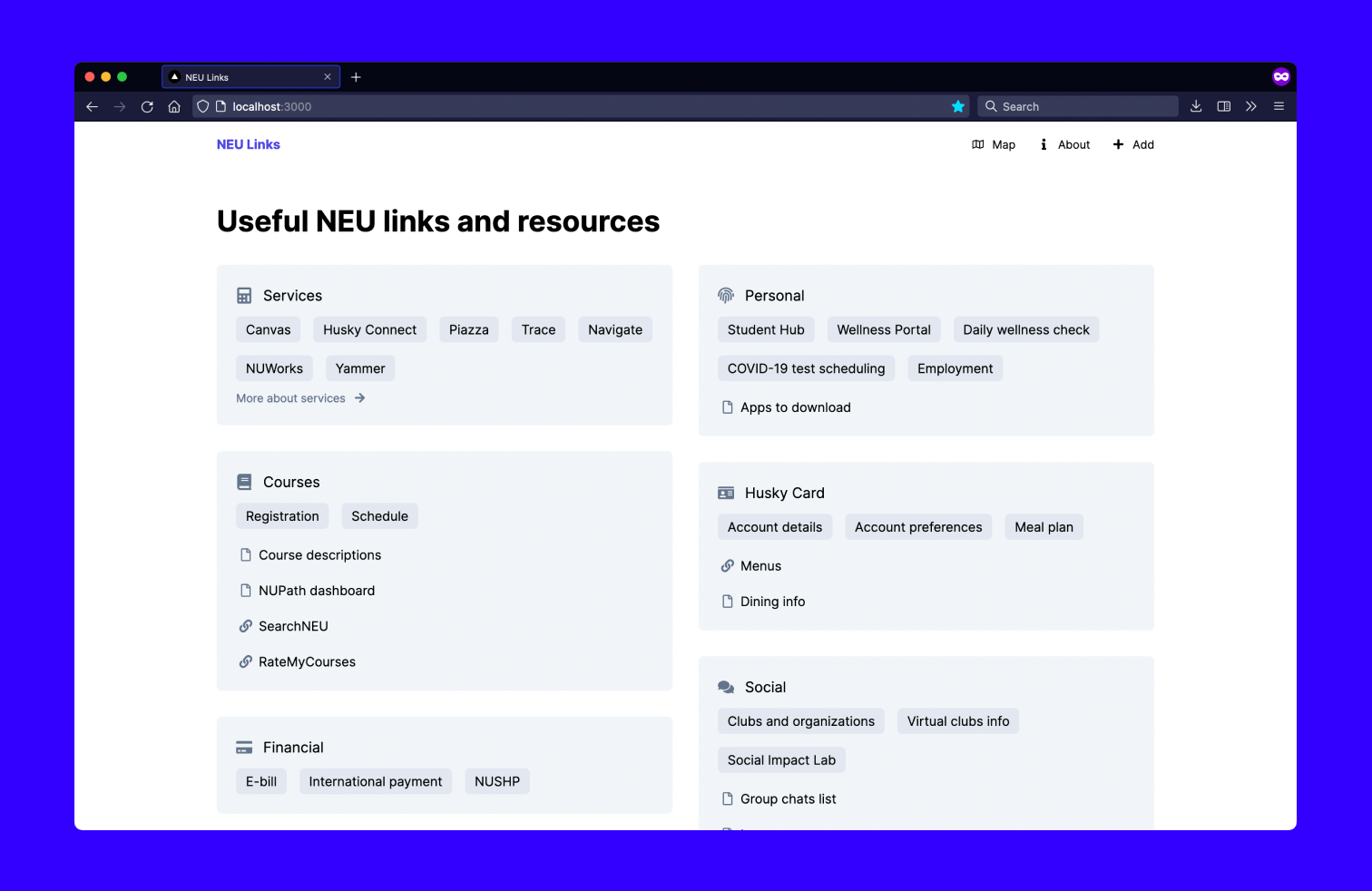
I like to create websites, so using Google Sheets as a backend, I made a simple website:

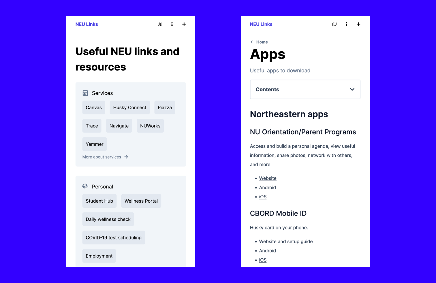
And of course, it’s mobile friendly too!

It’s not the best website, but it works, and people seem to like it! I’m gonna continue working on this and make small improvements here and there.